5th April 2016
Although, in the United Kingdom, we now spend less of our income on food than we used to, food prices in recent years have often gone up quicker than inflation, and much quicker for some items than others. This has the potential to impact on the food choices that people make, particularly those on a lower income.
Comparing changes in price between different foods isn’t straightforward, and the most appropriate metrics for comparison has been debated at length. Proponents have variously argued that food prices should be compared in terms of their calorie content, their weight, or their typical portion size. And is the percentage change most important, or is it about the absolute pounds and pence in people’s pockets?
With a new interactive graph from CEDAR, you can choose your own measures and metrics to explore 13 years of changing food prices in the UK. You can compare changes in price by energy (calories), weight and portion size, examine food groups and relative healthiness of foods, and compare individual food items against each other.
Access it here: [Currently unavailable]
About the data
This interactive uses food price data from the Office for National Statistics UK Consumer Price Index (CPI) and matches items to the National Diet and Nutrition Survey (NDNS). ‘Healthiness’ of food is defined using the Food Standards Agency’s nutrient profiling model based upon energy, saturated fat, total sugar, sodium, fibre, protein, and fruit, vegetable, and nut content.
A walkthrough of the interactive
There’s a lot of data to take in, so some worked examples are below.
Pounds and pence vs percentage
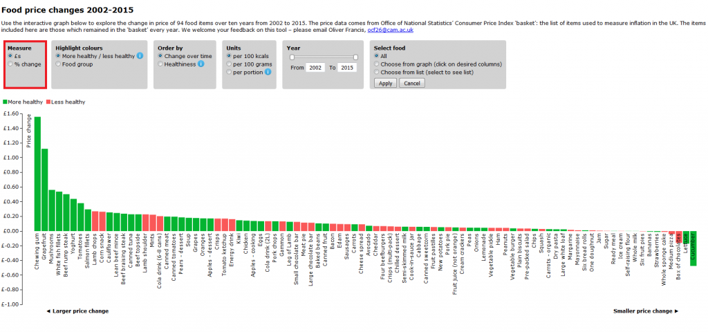
First, in the default view, with the Measure box set to £s, we can see that it looks as if healthy foods are the ones showing the big increases:
But, select “% change” and it looks rather different.
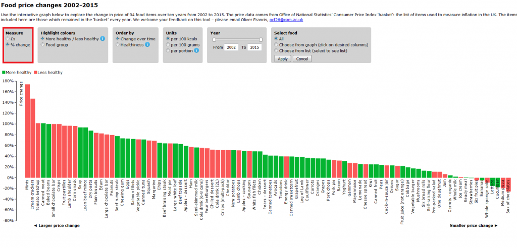
And to get a different view of the same data, you can use the Order by box to rank items by healthiness rather than change over time.
Different units
Similarly, different pictures emerge in the “£s” price change when changing the unit of food measured using the three options in the Unit box.
Comparing food groups
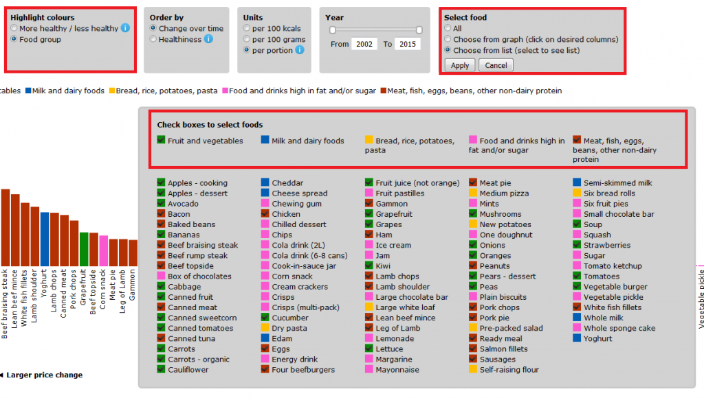
Drilling down, let’s look at how some food groups have fared against each other. For instance, use the Highlight colours box to select “Food group” and then use the Select food box / “Choose from list” / to select “Fruit and vegetables” and “Meat, fish, eggs, beans, other non-dairy protein” in the top row.
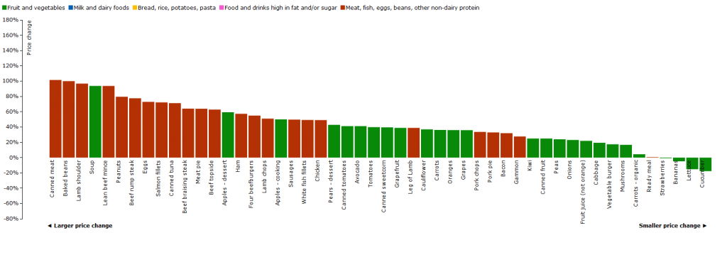
It looks as if (in percentage change at least), protein is getting more expensive quicker than fruit and vegetables.
But in absolute price change, the picture is more mixed.

Specific foods
Or we can compare the price change of specific products, again using the Select food box as above. (To return all foods to visibility, select “All” and press “Apply”.) You can select foods either from the list, or directly from the graph. (Where the text overlaps the graph, it may be easier to use the list selector.)
For instance, from 2002 to 2008 (use the slider on the Year box), the price of strawberries fell by around 40% (perhaps reflecting new practices in their cultivation that has allowed them to be in the shops longer). But since 2008, their price has gradually crept back up, so that by 2015 they were at the same price they were in 2002. In 2012 the BBC even asked Are British strawberries under threat?
So, jump in, take a look. Let us know what you think. Send any suggestions or comments to ocf26@cam.ac.uk
Associated research papers
You can also read more about recent trends in UK food prices and a new CEDAR research paper on the debate about how we measure food price, and why it matters to public health:
- Comparing Prices for Food and Diet Research: The Metric Matters, R. V. Jones and P. Monsivais, Journal Of Hunger & Environmental Nutrition, 2016
- The Growing Price Gap between More and Less Healthy Foods: Analysis of a Novel Longitudinal UK Dataset. Nicholas R. V. Jones, Annalijn I. Conklin, Marc Suhrcke, Pablo Monsivais, PLOS ONE, 2014

 MRC Epidemiology Unit